Alessandro's Striplac
& Facebook Tabs
Alessandro is an internationally known comestic company. They came to Jäger & Gejagte looking for solutions both for their social media as well as for their recently released Striplac product. For the formers we have done Facebook Tabs and for the latter a hotsite.
Digital Art Direction / Webdesign / Project Management

Alessandro came to us with basically two projects: the release of a new product and the construction of a knowledge database for their facebook fans that would help them to engage in their courses.
At this project, I not only was present in the strategical meetings with the client and my boss at Jäger und Gejagte, as I ended up also being the Project Manager and, after explaining the projects in depth to the client, could increase the budget for the Tabs' Project in 3x the original value. This way we were able to build a good schedule and a plan of action in order to execute the projects in the most efficient way.
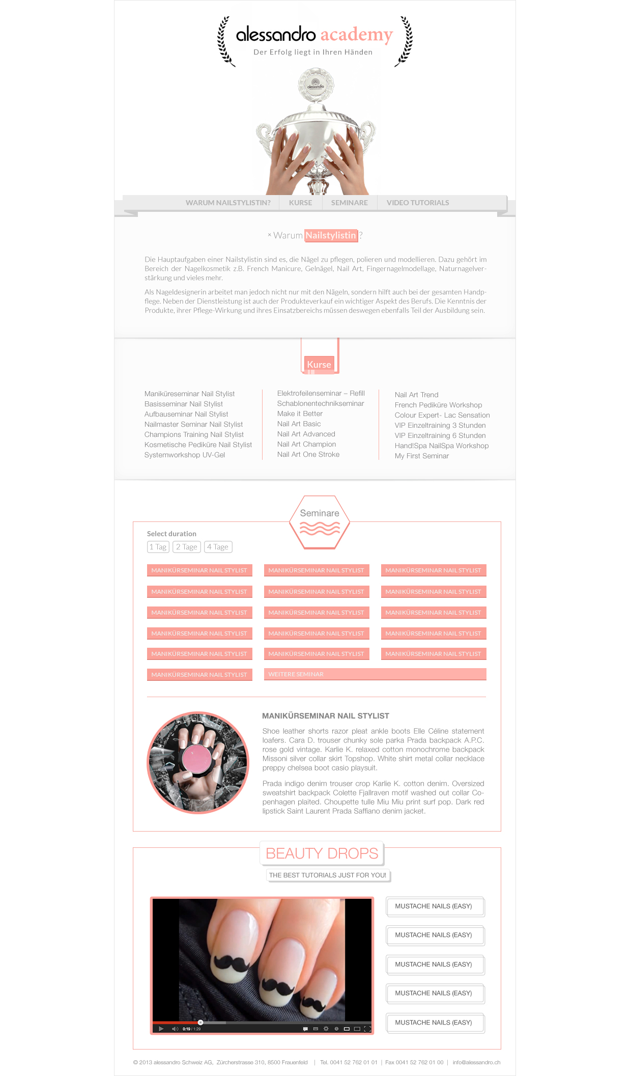
1. Facebook Tab 'Alessandro Academy'
For the first Facebook Tab, The Academy Tab, I have designed everything from logo to UI. The main goal here was to make available for the user the list of courses and description of courses given by Alessandro Academy with the plus of highlighting the video tutorials we have input at an Alessandro Youtube channel. The central goal of those tabs was to raise awareness of the users to a knowledge database about Alessandro and its activities.
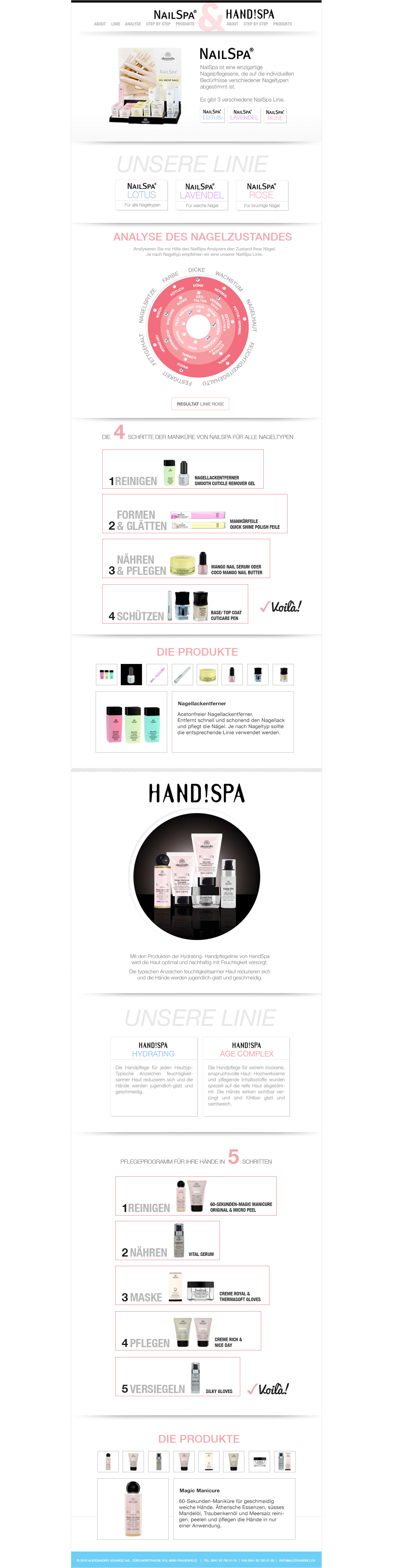
2. Facebook Tab 'NailSpa & Hand!Spa'
Originally thought as two separate tabs, Alessandro Nail Spa and HandSpa ended up being put together as a single facebook tab. Because of that and the ammount of content, we have fixed the Navigation up so that the user could hover through contents fluidly. In order to determine the best product for the Nail Spa of the user, we have created an interactive interface that crosses data to give an answer of which kind of treatment should the user go for.
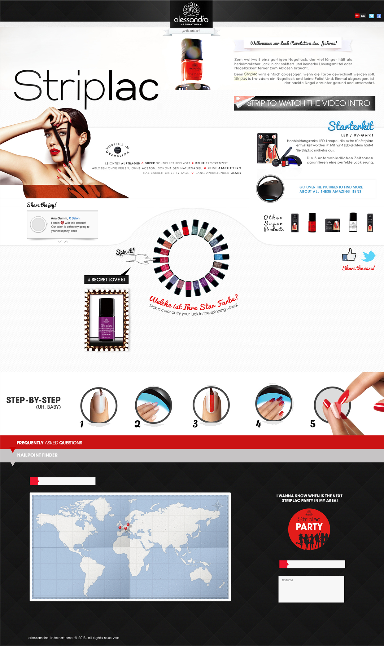
3. Striplac Hotsite
Striplac was about to be released when Alessandro reached us looking for buildung a hotsite. He have build an interface of high impact, with a fluid movement of the eye going through each section and making the climax of the page at the center of it with a game which presented the user the colors of the collection. Under the picture below, by the end of the page, you can see the video with the explanation for the stylistic and UX choices.